

CSS Units in 5 Minutes
In this blog post, I'll talk about absolute & relative units in CSS as well as discuss the most common CSS units.


Okay, let's talk about CSS units.
Before we get into the different types of CSS units, let's take a moment to understand what CSS units are.
Simply stated, units are a way to determine the size of an object. If I say what's the width of your mobile screen, we can measure the size in different units. You can say my device's screen is 250px wide, or you can say it is 3-inches wide.
Similarly, CSS units determine the size of any particular element or its properties.
There are two types of units in CSS:
- Absolute Units,
- Relative Units.
Absolute units remain the same size regardless of the window size, or parent element's size.
Like, for example, 1 inch. 1 inch will be the same universally. Whether, we see something of width 1-inch on a mobile screen, desktop screen, or in real life. The value of 1 inch will not change in any scenario.
Similarly, 1px.
Relative Units on the other hand are relative to the window size or the size of its parent.
For example, let's say we have a red box with a width of 50% of its parent. Now, the width of the red box will increase or decrease as the parent element's width increases or decreases.
Now, that we know the fundamental difference between Absolute & Relative units, let's look into what are some of the most common units in CSS.
Here are some widely used units in CSS:
- px
- %
- em
- rem
- vh & vw
1. Pixel
Pixel (px) is an absolute unit and it is one of the most common units when it comes to screens. It roughly represents 1/96th value of an inch.
To get an idea of the appearance of a px, imagine a CRT monitor from the 1990s: the smallest dot it can display measures about 1/100th of an inch. The px unit got its name from those screen pixels. ~ W3.org
2. Percent (%)
A percent is a relative unit and its value depends on the size of the parent. Let's take the following HTML & CSS code as an example:
<div class="outer">
      <div class="inner"></div>
</div>
.outer {
  width: 100px;
  height: 100px;
  background: red;
}

.inner {
  width: 50%; /* 50% of parent, in this case, parent is outer class*/
  height: 50%;
  background: blue;
}
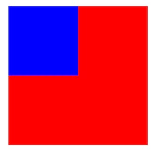
In this case, the width & height of the inner div is 50% of its parent's size. So, the value of width & height of the inner div is 50px & 50px respectively.
3. em
em is a relative unit and its value depends on the font-size of its parent. By default, 1em = 16px.
To understand more about em, let's take the following code as an example:
<div>
    <h3 class="relative">hello, world!</h3>
</div>

<div>
    <h3 class="absolute">hello, world!</h3>
</div>
div {
  font-size: 10px;
}

.absolute {
  font-size: 20px;
}

.relative {
  font-size: 2.5em; /* 2.5 * 10px = 25px, because div is the parent */
}
Here's the result:
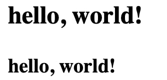
Here you can see how the font sizes differ from each other, because the font-size of the h3 element with absolute class is absolute with the value of 20px, and the font-size of the h3 element with relative class is relative to the font size of the parent div.
Since the font-size of parent div is 10px, the font-size of the h3 element (with relative class) is 2.5 times the value of font-size of the parentdiv.
4. rem
rem is quite similar to em, having one key difference. The value of rem depends on the root (e.g. the <html> element) rather than the parent.
Let's consider the following code as an example:
<div>
    <h3 class="relative">hello, world!</h3>
</div>

<div>
    <h3 class="absolute">hello, world!</h3>
</div>
html {
  font-size: 15px;
}

div {
  font-size: 10px;
}

.absolute {
  font-size: 20px;
}

.relative {
  font-size: 3rem; /* 3 * 15px, which is set in html selector = 45px */
}
Here's how it would look:

Notice here how the
h3element withrelativeclass didn't consider thefont-sizevalue of the parentdivthat was 10px, but it considered the value of the root element, i.e. thehtmlselector. So, 3rem = 45px.
If we replace rem by em in the above code, the font-size of the h3 element with relative class would be 30px.
emandremare both relative units that scale according to another element.emis relative to thefont-sizeof the parent element whileremis relative to the root.
5. Viewport Height & Viewport Width (vh & vw)
Viewport height & width are relative to the size of the viewport instead of being relative to parent or root.
Now, what the heck is a Viewport? Simply, a viewport is the browser window size, excluding the UI, menu bar, etc.
1vh = 1% of the viewport height.
1vw = 1% of the viewport width.
To understand more, let's take a lot at the following example code:
<div class="top"></div>
<div class="bottom"></div>
.top {
  background: black;
  height: 50vh;
  width: 100vw;
}

.bottom {
  background: green;
  height: 50vh;
  width: 60vw;
}
Here's how the above code would look like:

Notice how the top div is spanning across the entire width of the viewport, and how the bottom div is only taking 60% of the viewport as its width. Both divs are taking exactly 50% of the viewport's height.
So, in the blog post, we briefly covered different units in CSS. I hope you found this post informative.
If there's something I missed or mentioned incorrectly, please do let me know in the comments below. Your feedback will be highly appreciated.
That's it for today! Thank you for taking the time to read my blog.
I'll be back with another blog post soon. Have a nice day!